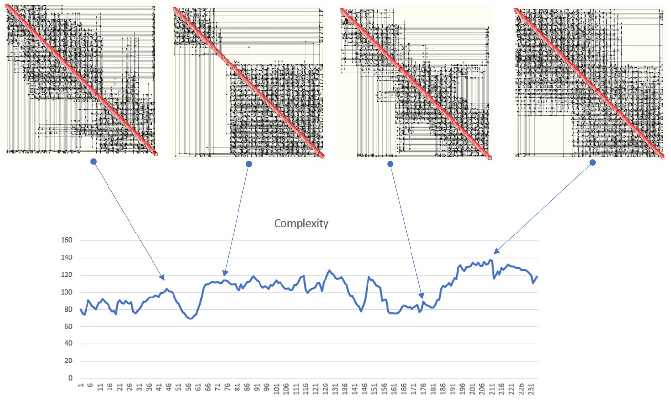
A QCM (Quantitative Complexity Management) analysis of a data set produces what is known as a Complexity Map – an illustration of the topology of information flow within a given system. A simple example is shown below.
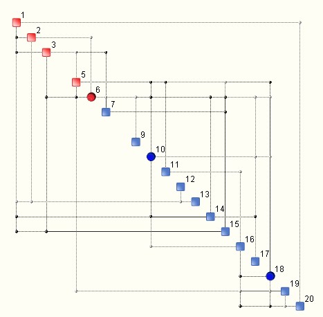
The discs are known as hubs and they indicate variables that have a larger footprint on the underlying system.
Once the Complexity Map is avaliable, the complexity of a given system may be computed, as well as its bounds, especially the upper bound known as critical complexity. This procedure constitutes the heart of the Artificial Intuition algorithm.
However, what is not so obvious is that the Complexity Map is only the tip of the iceberg when it comes to understanding complexity and its structure, as well as of the nature of the multi-dimensional data under analysis. Complexity is not just a number that is attached to a map, or a graph. When multi-dimensional data is ‘rugged’, the corresponding Complexity Map is a topological sum, a sort of envelope, of other ‘smaller’ complexity maps known as modes. An example is illustrated below:

What most users of our QCM tools get to see is what is on the left hand side of the equation. Real, deep understanding of complexity means knowing what is going on on the right hand side too. Each complexity mode has its own complexity as well as ‘intensity’, which is measured via its frequency of appearance within a given data set. We could refer to this frequency as likelihood.
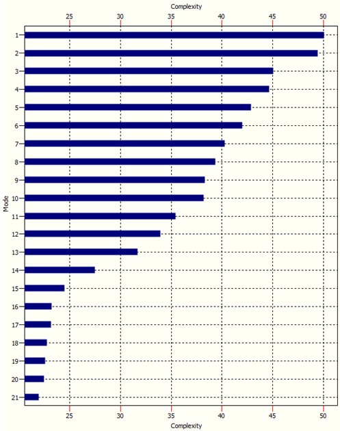
The Complexity Spectrum (not to be confused with a Complexity Profile) of a system is graph wich ranks the modes according to their complexity – see example below:
The modal intensity, or ‘modal ‘strength’ chart is similar:
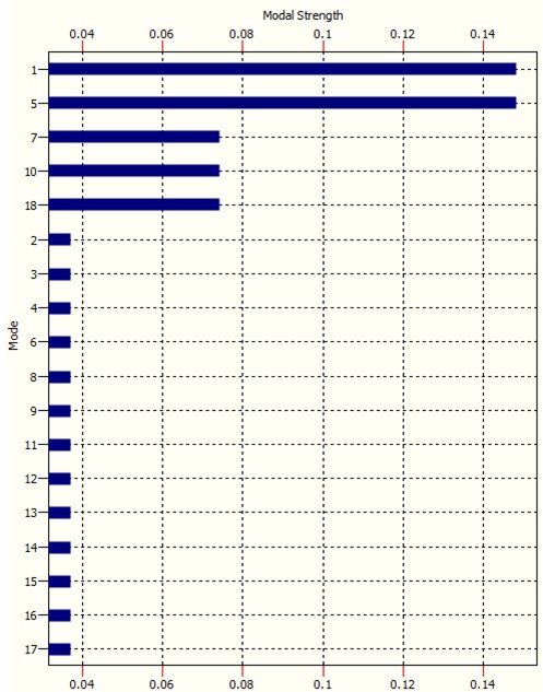
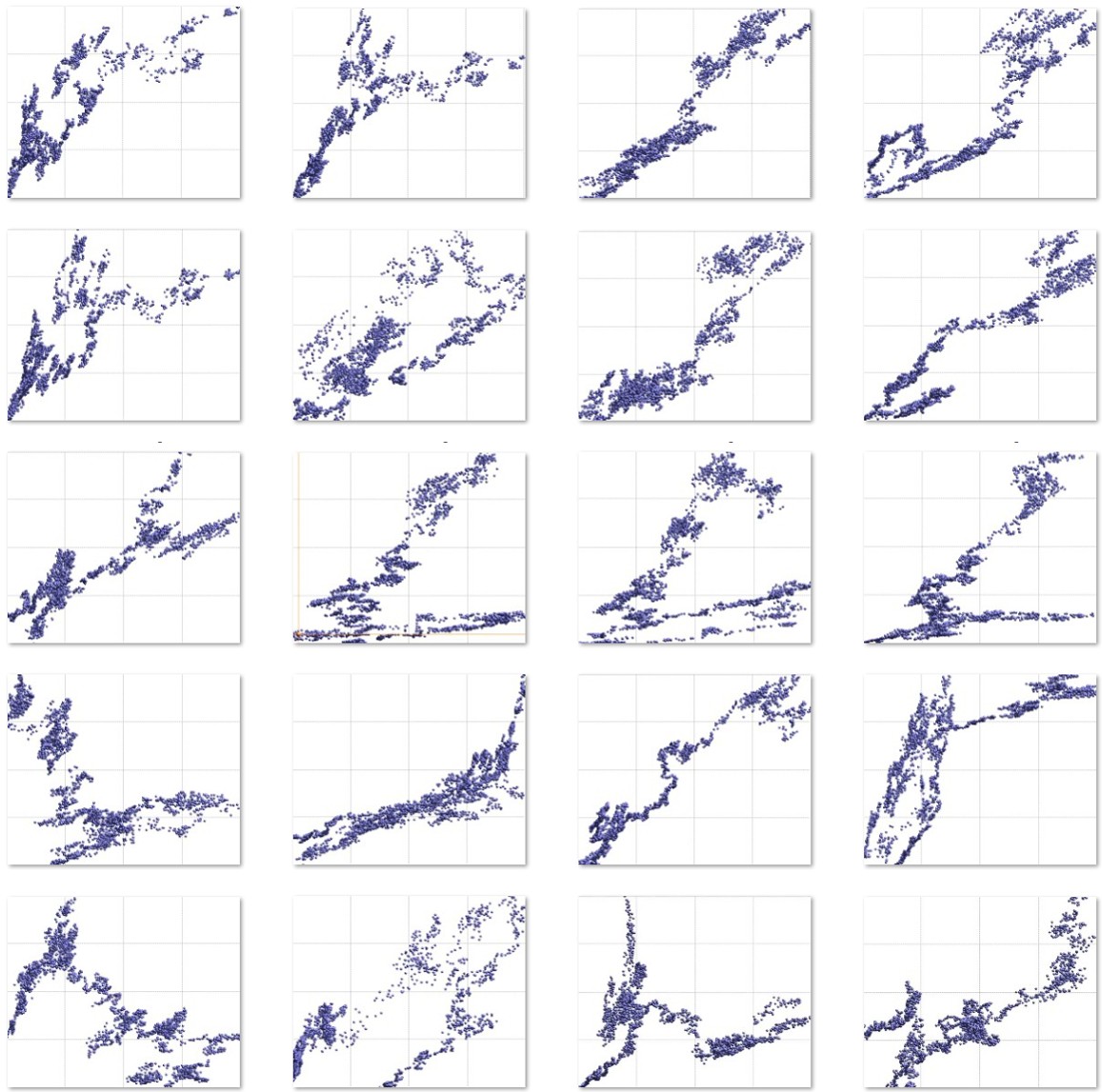
It is clear how modes 1, 5, 7, 10 and 18 in this case are the ‘dominant’ modes. It is these modes that drive complexity. The remaining modes are called residual modes. The order of modes is according to their respective ‘strength’, i.e. likelihood of occurrence. The more ‘rugged’ multidimensional data is, the more modes it will harbour. An example of a rugged data landscape is show below.
The “true” value of complexity is a weighted sum of all modal complexities where the weights are modal intensities. The popular measure of complexity that OntoNet computes is an approximation of the above.
NB. This kind of analysis represents what happens at one single time step. Imagine now how involved things can get when the above is repeated at each step of analysis of real time data.
This short blog illustrates why high complexity is a problem. The dynamics of very complex systems can be extremely involved since their behaviour can be driven by a myriad of modes which can change over time. Mode switching can often happen spontaneously, or due to even minute changes in certain underlying parameters. And herein lies the problem. Mode switching means the system suddenly starts to behave differently. It starts to suddenly show a different face, sometimes developing chaos or other forms of intricate behaviour, peppered with bifurcations or attractors. Very high complexity means this happens more frequently and the degree of surprise increases. This can make control of such systems very difficult. A small example of what this means is shown below.
The above example is a very small case with only 120 dimensions.

Contact us for information.

0 comments on “The Hidden Face of Artificial Intuition”