
Contemporary real time system monitoring appears to be the same in each discipline and field of application. Whether it is an aircraft, a chemical plant, a hospitalized patient or an assembly line, the logic is always the same:
- Deploy a set of sensors
- Establish admissible upper and lower bounds for each sensor (channel)
- Define a nominal value for each channel
- Monitor deviation from nominal
- Trigger alarm if value approaches one of the bounds
The surprising thing is that only on rare occasions are the relationships or inter-dependencies between data channels analyzed. And yet, if one has N data channels, the number of possible channel inter-dependencies is (N x N – N)/2. For N=100 this is nearly 5000. These inter dependencies establish structure, a map, or a graph, which, at the end of the day, illustrates how things work. Knowing which channels vary together, and how they do it (in a linear, nonlinear or chaotic fashion) is paramount when it comes to finding and understanding anomalies.
But there is more. Conventional monitoring often fails to provide some sort of systemic quantity, or indicator, which would furnish a holistic reflection of the “state of health” of a system. In finance they have done so by inventing stock market indices, which combine tens or hundreds of stock prices into a single number -think of the NASDQ or the S&P. But in engineering, production, intensive care, or medicine in general, there is nothing of the sort. For example, how do you combine heart beat frequency, cholesterol, blood pressure, CO2 concentration and creatinine into one index? How do you something similar for an aircraft or a manufacturing plant, where there are thousands of heterogeneous data channels? The market index is easy since all channels – stocks – have values expressed in dollars, but when it comes to combining pressure, temperature, flow, efficiency and vibrations things get complicated. So,
how does one combine N channels of diverse data types into one scalar indicator?
Complexity is one example of a scalar systemic indicator which accomplishes exactly that. Since our complexity metric has an upper bound, known as critical complexity, the distance from critical complexity is a measure of a system’s state of health.
Below is an example of complexity evolution of a hospitalized patient. The complexity function combines two dozen channels of real time data into a single index. It is not difficult to imagine that in proximity of the peaks interesting things happen.

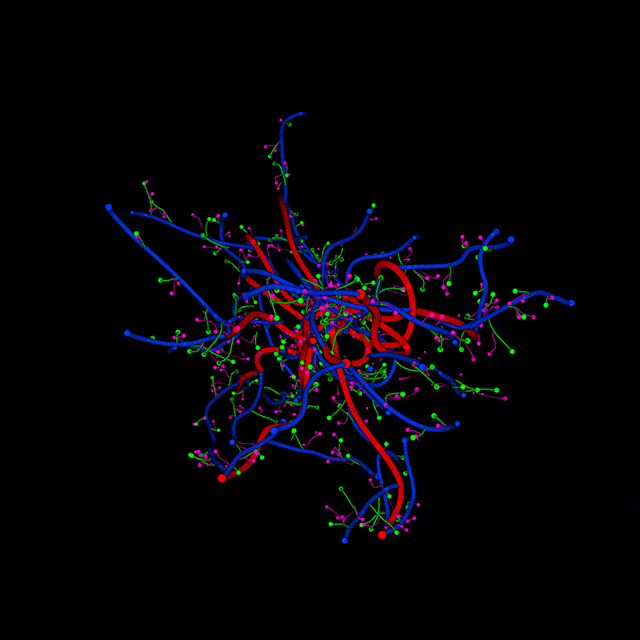
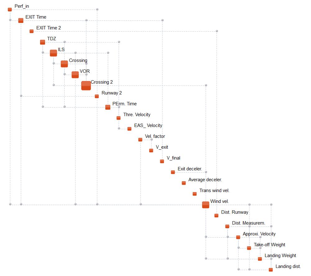
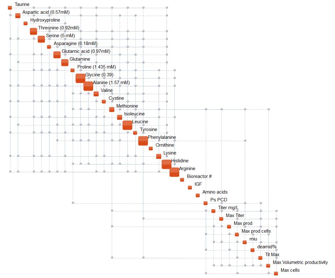
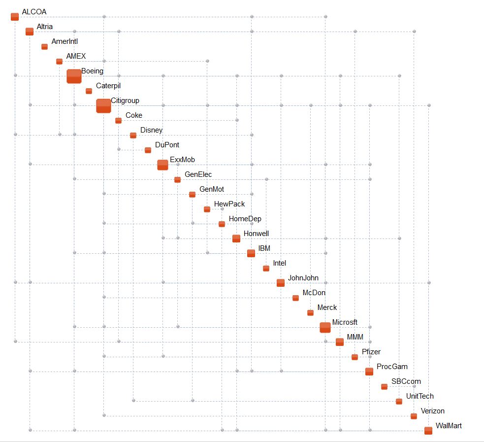
But setting aside the issue of state-of-health indication and monitoring, the immense importance of structure is what we want to underline in this blog. The insight gained from just looking at a Complexity Map is phenomenal. Some nice examples are shown below. What’s important to keep in mind that these maps change over time! This means that there is an even deeper significance here – the rate of change of structure, a sort of structural derivative – which delivers even more information and knowledge.
Data or data analysis cannot produce knowledge. It can only produce information. In fact,
Knowledge is inextricably linked to structure
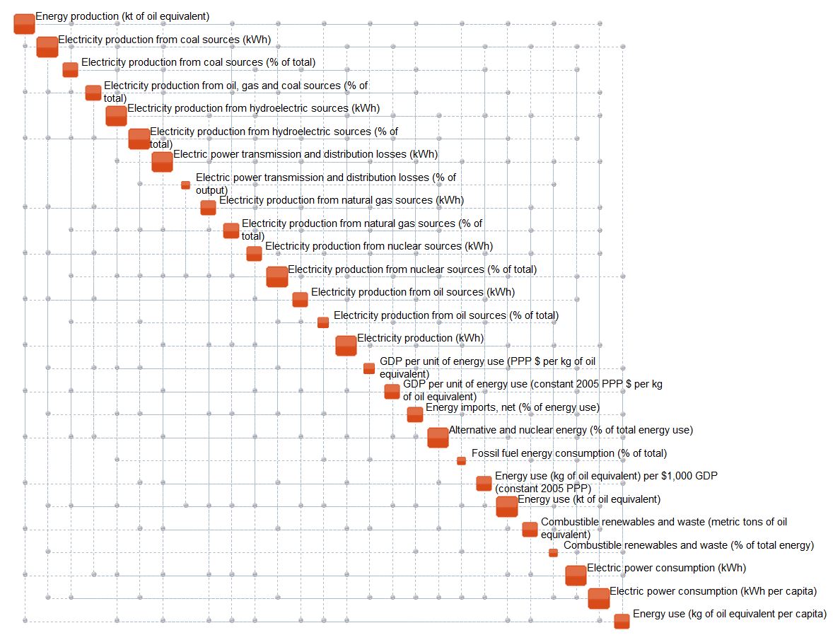
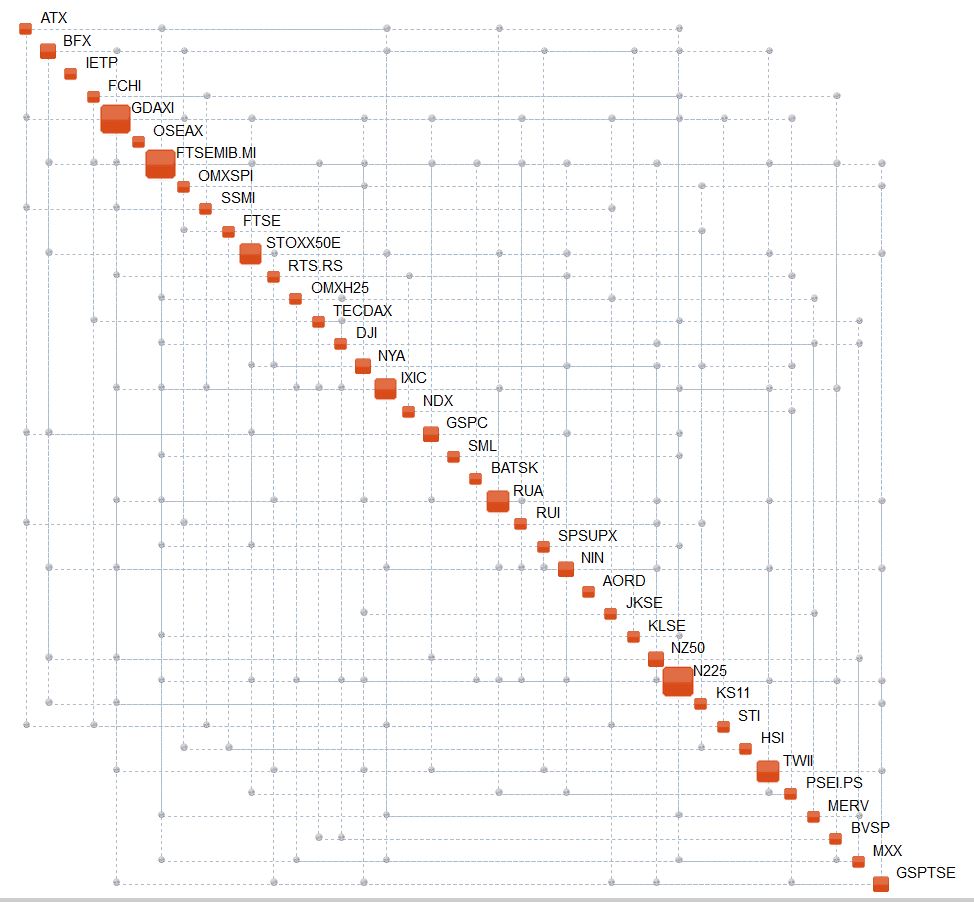
Examples of Complexity Maps are illustrated below. They show why often it is so difficult to understand and explain the behavior of many systems.
Air Traffic Management
Bioreactor
Dow Jones Industrial Index
Electroencephalogram
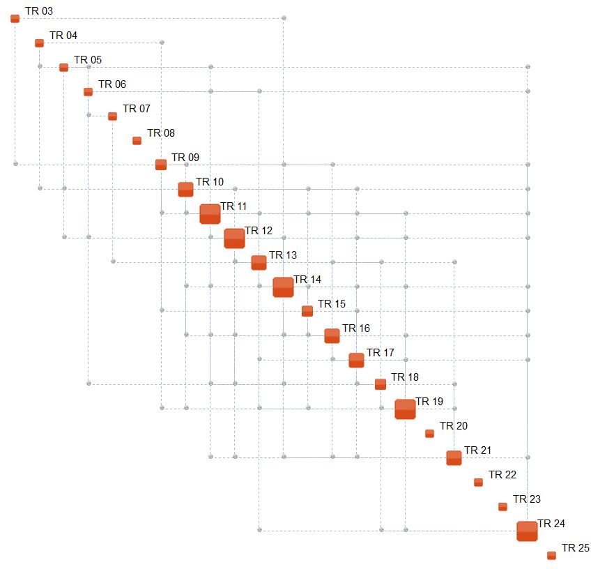
Energy Production
Global Finance (major stock market indices)
Patient in Intensive Care Unit

Nuclear Power Plant
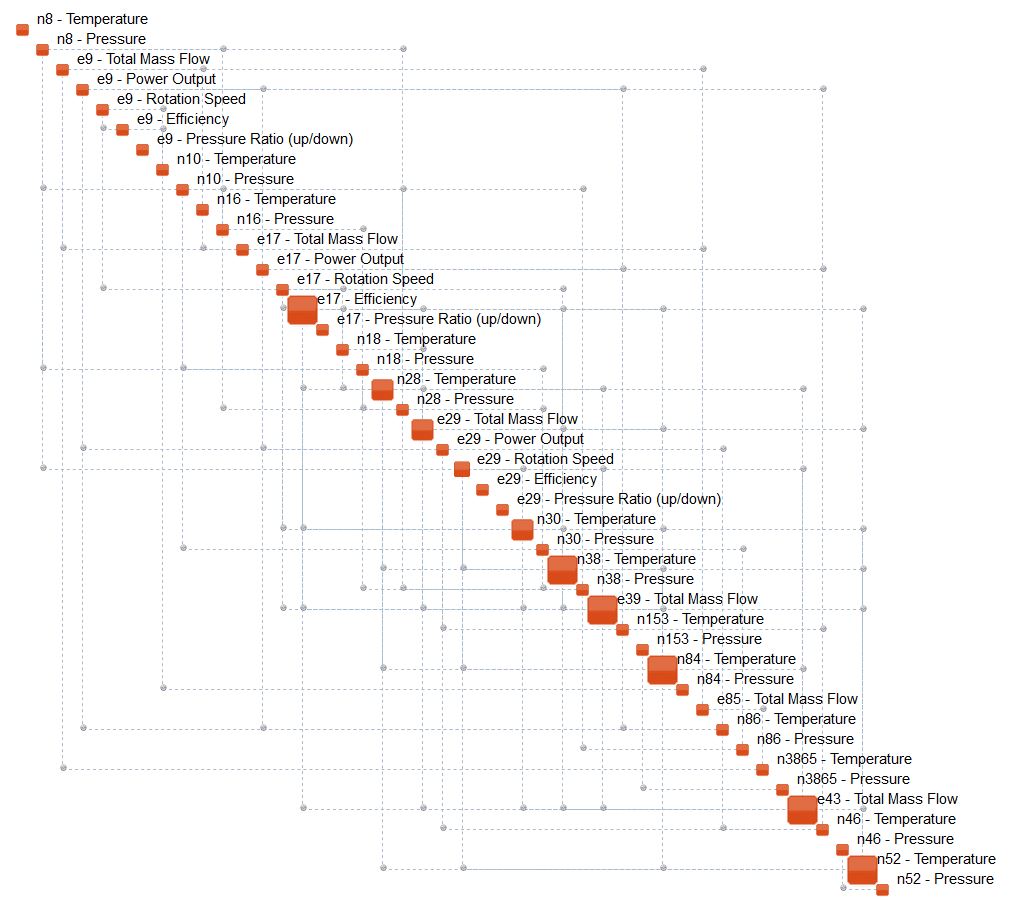
Turbine (only portion of Complexity Map is shown)


Reblogged this on Artificial Intuition and commented:
Data to Structure – New Paradigms in System Monitoring.
LikeLike
Reblogged this on Calculus of Decay .
LikeLike