

Using annual data from the World Bank, spanning the last 5 decades, we have computed the complexity of the World seen as a system of interacting systems (countries). There are currently 196 countries (the US recognises only 195), each of which is monitored via a series of over 1250 indicators, covering the economy, energy, transportation, education, health care, infrastructures, agriculture, environment, telecommunications, finance, crime, military expenses, etc., etc. Doing the arithmetic leads to approximately 250000 parameters which describe the entire system, i.e. the World (List of indicators).
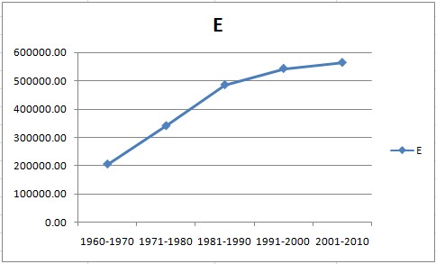
The results are quite astonishing – see plot below illustrating the evolution of complexity (middle curve) as well as of it upper (critical) and minimum bounds.

As a system evolves and develops new functionality it becomes more complex. This is natural. The direction of evolution in our biosphere is a good example: from single-cell organisms to mammals. However, each system in nature possesses also the so-called critical complexity (green curve in above plot). This too increases as the system evolves. The same may be said of the lower complexity bound (blue curve). When a system functions close to the blue curve, its behaviour is deterministic and predictable. The problem is to to stay away from the critical complexity curve because there things get chaotic and uncontrollable. The amount of chaos (uncertainty) in the system is reflected by its entropy, see plot below.


0 comments on “How Complex is the World? We’ve Measured It.”