
It has been a while since we analyzed global covid-19 data (Worldometers is source). The reason we have suspended our analyses is that the reporting of covid-related deaths – “died because of covid” or “died with covid” – is not a transparent process hence it lends itself to manipulation. Analyzing warped data makes little sense. Our previous blog on the matter sheds some light on this issue.
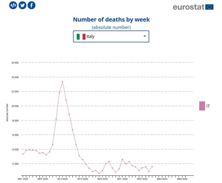
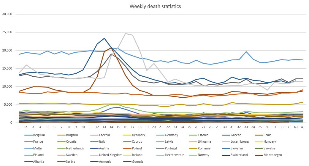
However, when the same warped data is used to predict a second and third, and why not a fourth and fifth wave, or when new virus mutations crop up here and there, that (will) conveniently justify new lockdowns or, in the least of cases, a prolonged state of semi-lockdown or a state of emergency, it is time to take a new and different look at the said data. To that end we have analyzed weekly death rates data published by EUROSTAT. An example of such data is illustrated above, showing the case of Italy. A large peak may be observed at week 13 (first week of April). The said data spans weeks 1 through 41, until the first week of November. The entire data set is shown below.
One way to “measure a crisis”, or a phenomenon, is to measure its complexity and to track it over time. The more complex a crisis the more difficult it is to understand and to govern. High complexity in the context of a crisis means the situation may diverge, i.e. run of our hand. This is quite evident.
Below is the evolution of complexity of the covid-19 data relative to the above countries (mainly Europe). As we have used a data window of 4 weeks, step 1 in the chart corresponds to week 4. Basically the chart, as well as the following ones, are shifted by 4 weeks. This means that complexity peaks in week 15+4 = 19, i.e. during the third week of May. There is a second smaller peak in week 21+4, during the first week of July, corresponding to the ripple in the raw data around week 33-35 (August-September) – see red trend line.
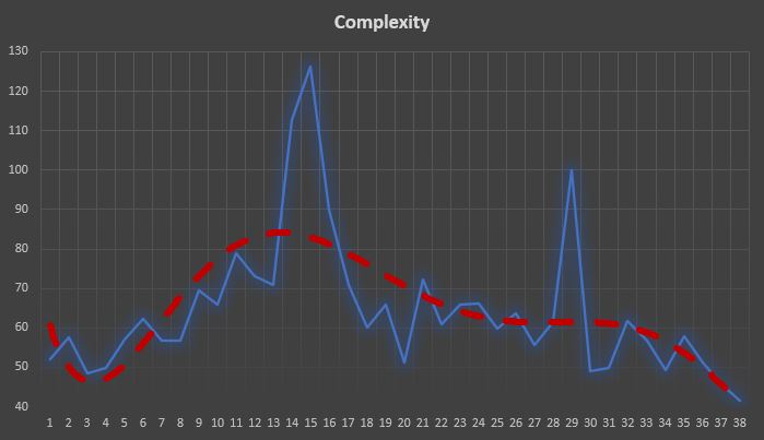
The bottom line, however, is that the complexity of the crisis is diminishing rapidly, at least until week 41 – see the red trendline
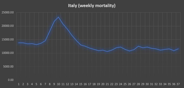
We report below the figures relative to Italy (the plot is now aligned with the one above).
It is clear how the peak of complexity, in this case, lags behind the peak in the raw data by approximately 5 weeks. It is also true, however, that complexity rises very clearly well before the mortality rates commence to grow. Employing a new complexity index – which we call Complexity mark 2 – the situation is quite different.
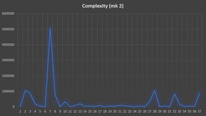
Complexity now anticipates the peak in mortality by 2-3 weeks and there is some ripple towards the end of the chart , starting during week 28+4. However, these peaks are 5 times lower than the primary peak corresponding to the first wave of the virus. This means, that during week 41 there was no indication of a second wave.
NB. The above analysis has been performed using data which we find disputable, as it is not easy to distinguish a death with covid from a death due to (only) covid. Actually, no such distinction is made – most deaths are attributed to covid-19. This skews the results of any analysis.
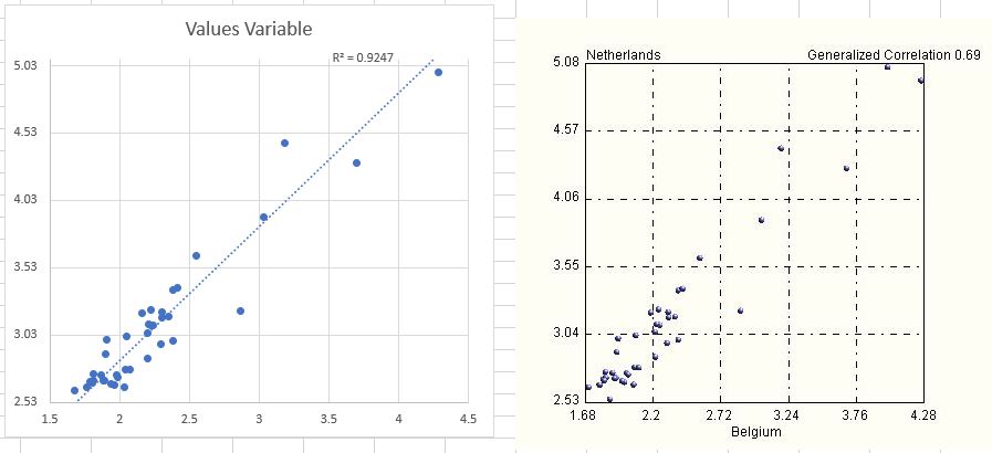
A note on correlations. Most analyses in medicine (and biology) are performed using linear (Pearson) correlations. Conclusions are drawn based on correlations, their existence (or lack thereof) and their strength. But we know that linear correlations are very dangerous, especially if in the hands of a non-expert. In fact, linear correlations can be very confusing, misleading and even lead to a false sense of control and comfort (placebo). Below we report the strongest correlation we have found in the data – the correlation between deaths in Netherlands and Belgium, two bordering countries. While linear correlation is a massive 96%, our more realistic generalized correlation is 69%, a full 27% less. Examining the two plots below explains why this is the case. The data is most certainly not linear as most of it is concentrated in a cluster, with a few isolated and distant points in the top right quadrant of the charts.
As information (as well as projections) on covid-19 that is given to the public is based on linear correlations, it is easy to imagine by how much off they can be. Consider for example the three data points within the red ellipse in the plot below.
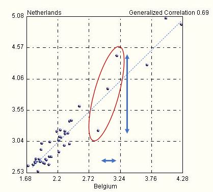
For values (Belgium) between 2.72 and 3.24, a small variation leads to huge jumps in the other variable, between 3.1 and 4.5, while the slope of the linear model (dashed line) would suggest a far lower sensitivity. In other words, this linear model is highly unreliable and it cannot be used for forecasts or projections. And yet it is. How can one trust and conceive any strategy based on such an approach?
Question: If there were only one wave of this nasty flu, would the world still be pursuing so hastily a vaccine (miraculously ready in 6 months, when normally it takes 3-5 years) ? To answer this question, follow the money.

Amazing analysis of available data, with intelligent conclusions.
LikeLiked by 1 person
It’s a pity the data you used is till the first week of November. May we now be in a second peak, albeit on a new strain…?
LikeLike
Unfortunately this is the only data provided by EUROSTAT. All viruses mutate and express themselves in the forms of strains – this dynamics is a characteristic of all viruses.
You may find this other blog of interest since you mention “peaks”:
https://ontonixqcm.blog/2021/01/06/manufacturing-waves/
Thank you.
LikeLike