
 Assetdyne analyzes stock market data on a fortnightly basis, measuring and tracking the complexity and resilience of the major US indices. Results are reported here, where it is possible to navigate interactive Complexity Maps of the said indices.
We know that an evolving system, such as a biosphere, a society or an economy, becomes progressively more complex as it grows. Inter-dependencies between the various players form and the amount of exchanged information increases, as well as the overall level of system intricacy. In other words, complexity measures the “vitality” of a system. On the contrary, when a system degrades, ages or goes into a state of crisis, the previously formed structure of inter-dependencies and information flow starts to “dissolve”. An eloquent illustration is the evolution of complexity of the Eurozone illustrated below (the analysis is based on 24 macroeconomical parameters for each of the 28 member states – data provided by EUROSTAT):
 The black curve – representing the current system complexity – has been growing steadily until it peaked in Q4 of 2007, after which it commenced a steady fall, synonymous of destruction. The mild signs of recovery, which are visible after Q4 2012 are too weak to speak of sustained recovery but a timid upward trend seems to be a good omen. The bad news is that complexity is very close to the critical complexity of the system (red curve). This means the system is extremely fragile and ill-equipped to face shocks or contagion. The really bad news is that there seems to be no sign that this fragility is decreasing: we are indeed seeing mild recovery but it is a very fragile one.
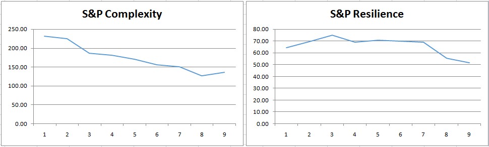
Let us take a look at the major indices on Wall Street: the S&P, the NASDAQ and the Dow. We report, in the figures below, the evolutions of complexity and resilience (the opposite to fragility) over the past four months (the period of analysis is 4-1-2014 – 26-4-2014).
S&P
 NASDAQ
 DJA
DJA
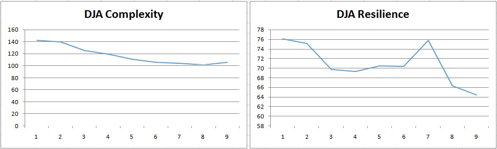 In all cases complexity is dropping steadily. In four months the S&P has lost 41% of its initial complexity, the NASDAQ 30% while the Dow 26%. In terms of resilience, the losses have been, respectively, 20%, 25% and 16%. What does this point to? Are we looking at a bubble about to burst? Dropping complexity is already pointing to a system that is “shrinking”, not in size or volume, but in terms of “vitality”. The dropping resilience indicates that as the markets are destroying complexity, the situation is becoming more fragile. Could this be the result of Quantitative Easing? Maybe. Paper burns very quickly. More soon.

0 comments on “US Markets – A Bubble Approaching?”