
The SETI – Search for Extra-Terrestrial Intelligence – is an initiative which has the objective of locating intelligent life in the Universe. Arrays of telescopes, such as the ATA, or large installations like the one in Arecibo, collect hundreds of terabytes of data every day, spanning a wide frequency band. Data typically has the aspect of a waterfall plot, where one finds time and frequency on the two axes. An example of a waterfall plot is illustrated below

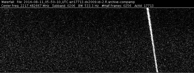
An example of a SETI time-frequency waterfall plot is shown below. The image has been obtained by the ATA (Allen Telescope Array). The white trace corresponds to the ISEE3 satellite.
It is images like these that are analyzed looking for suspicious signals which could point to something created artificially, i.e. extra-terrestrial intelligence.
This blog does not have the objective to provide an in-depth analysis of the SETI programme or to discuss the methods used to analyze the mountains of data it produces on a daily basis. The goal is to postulate a conjecture, to suggest a new approach.
One way to distinguish an anomaly on a chaotic/noisy background is to look for structure. Sure, also noise may exhibit structure but the objective is to look for structure which has a certain level of complexity, above a specific threshold. The likelihood of a highly complex structure to have formed randomly, i.e. without the intervention of intelligence, is evidently quite low. So, the idea is to rank the waterfall plots containing suspicious signals according to complexity and then to focus on the most complex one. Basically, we’re suggesting that higher complexity points, potentially, to intelligence. Clearly this is only a conjecture.
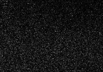
An example of a Complexity Map of a waterfall time-frequency image which has a low complexity – i.e. potentially is just noise – is illustrated below (only a small portion is shown):
Original image:
Corresponding Complexity Map (numbers along the diagonal correspond to frequency bands):
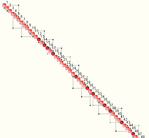
The map is quite sparse and the very small number of scattered interdependencies between frequencies points to an essentially random context. The nodes in the above map correspond to frequency bands. Again, the lack of structure could point to a ‘lack of intelligence’. However, this is what happens when the entire image is analyzed as a ‘static’ image. When the same image is analyzed using a moving window technique, i.e. each image has the same frequency bandwidth but spans a smaller and moving time-window, structure may emerge, as reflected in the complexity evolution shown below (see middle curve):
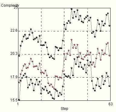
At frame 30 approximately, a jump in complexity is evident, which is accompanied by a change in the topology of the corresponding Complexity Maps (frames 25 and 37):


The corresponding complexities are 16.6 cbits and 21.8 cbits respectively.
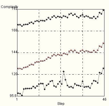
The situation changes of course when an evident feature is present in the waterfall image, such as an artificial satellite. An example is shown below:

The complexity evolution versus time is the following (see middle curve):
It is also interesting to analyze the ‘entropy-generalized correlation landscapes’ of waterfall images. Such plots shed further light into the structure of the waterfall plots from which they originate. An example is reported below.

A final example of analysis of waterfall images is shown below, whereby a comparison of two images is performed. The analysis is based not on the direct comparison of images but by comparing the topologies of the corresponding complexity maps. In essence, the idea is to identify the ‘difference between map’, both in frequency and time. Two maps, corresponding to a given waterfall image analyzed at two consecutive time steps are illustrated below:


A specific tool – OntoTest – computes a spectral norm of the topological distance between the two maps and provides a measure of their similarity.
An example of how sensitive this approach can be is illustrated below. Two identical images (180 x 128 pixels) are compared in which only one pixel has been modified (its intensity has been reduced by 20%) – see red arrow.
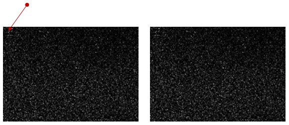
The system is capable of capturing this difference and indicates which pixel has been modified (1 out of 180 x 128 = 23040 pixels). The similarity of the two images is approximately 99.6%.
PART II
The SETI waterfall images typically have frequency on the x-axis and time on the y-axis. Analyzing these images from a complexity standpoint establishes the structure of frequency correlations – see for example the blue image above and the corresponding complexity evolution versus time.
Interesting information may be obtained by rotating the images by 90 degrees and seeking temporal correlation structures. The rotated image is this:

The evolution of complexity versus frequency is as follows (middle curve):
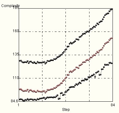
The above plot indicates that there is higher complexity (structured information) towards the higher end of the frequency spectrum.
The ‘entropy-generalized correlation landscape’ is also quite different:
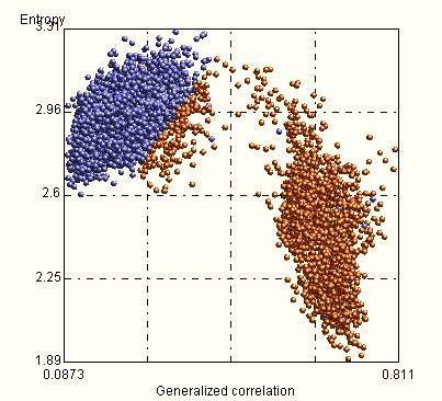
The landscape shows a ‘correlation gap’ in the 0.4 – 06 range which was not present when analyzing the original image.
High complexity rarely comes for free in Nature as Nature offers no free lunch. In his excellent book “No Free Lunch”, W. Dembski argues that ‘specified complexity cannot be purchased without intelligent design’. We believe that projecting the SETI problem on a complexity plane may provide new insights and help focus the search.

0 comments on “Complexity – A New Approach to SETI”